Field groups are used to attach more fields to the application. That is the components can only display title and description, but to add more information to the post items custom fields are used.
For instance, in the case of Job Portal Application, the component with the name 'opening' is created. Later on when posts for different designations are added in the component then it is required to elaborate the post by adding different fields.
To further illustrate consider a post name 'Php Developer' is created so in this case, the custom fields could be salary, job location
To create field groups, click on the Custom Fields menu item. It will bring you to the screen where all the created custom fields are displayed. This will show three sections i.e. fields, location, and settings.
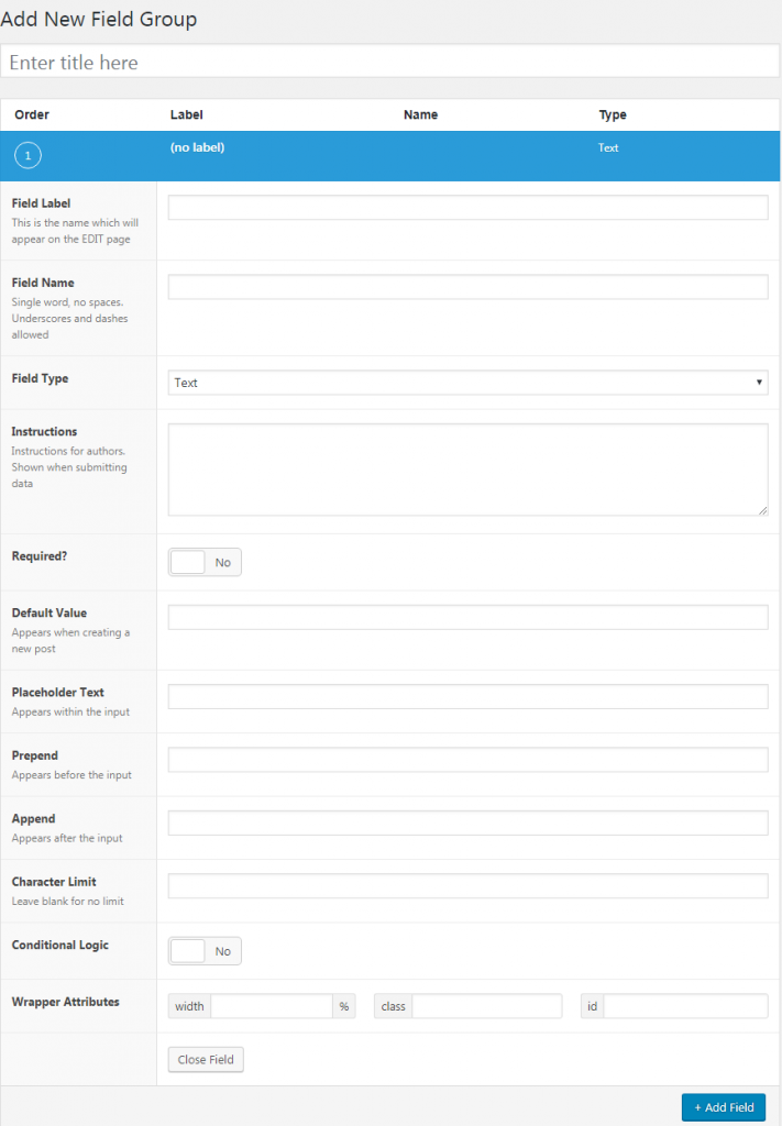
Add New Field Group
- Title: Each field group requires a title, that is shown in the meta box handle on the edit screen.
Field Section
To add new fields click on the blue button at the bottom.
- Field Label: This name appears inside the advanced custom field menus.
- Field Name: This name is used inside templates and codes. Do not use spaces between words, you can only use hyphens and underscores.
- Field Type: Select the field type from drop down.
- Instructions: You can leave instructions for authors. These are shown at the time of submission of data.
- Required: Select 'yes' to specifies fields are mandatory to fill in before submitting the form, otherwise changes will not save.
- Default Value: It automatically adds the value to the field when creating a post.
- Placeholder Text: It is the filler text that appears within the input fields on the editor screen.
- Prepend: It defines what appears before the input text
- Append: It defines what should appear after the input text.
- Character Limit: It specifies the number of characters that can be typed in.
- Conditional Logic: If this option is enabled it will allow you to have set rules to display the field.
- Wrapper Attributes: It allows you provide a particular width to the row. Also, you can add certain properties to the row using class and id column.
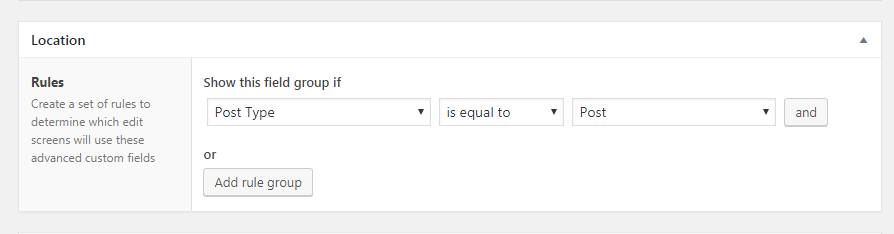
Location Fields
This section allows you to attach the custom fields to the particular post or component. The name of existing components will list in the drop-down.
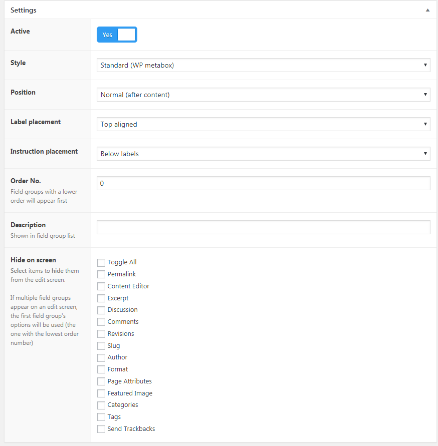
Settings
It allows to customize the edit screen where the field group appears.
- Style: It specifies two options. One is Seamless, which is without a WordPress
metabox and second is Standard which is placed inside ametabox .
- Position: It enables you to have three options: (1) Normal: Below content editor (2) High: Below title (3) Side: On the side of the editor.
- Label Placement: It allows to have two options either to place the label top aligned or left aligned.
- Instruction Placement: It can be placed either below label or below fields.
- Order No: It enables the field group to load and display in sequence.If there are several fields groups on the same page then the one with the lowest order will appear first.
- Description: It is shown in field group list.
- Hide on screen: Here you can tick the boxes that you want to hide from the edit screen. If multiple field groups appear on an edit screen, the field group with the lowest number will be used.